Introducing Seneca: Premium Te Reo Māori Notebooks by Colourcraft
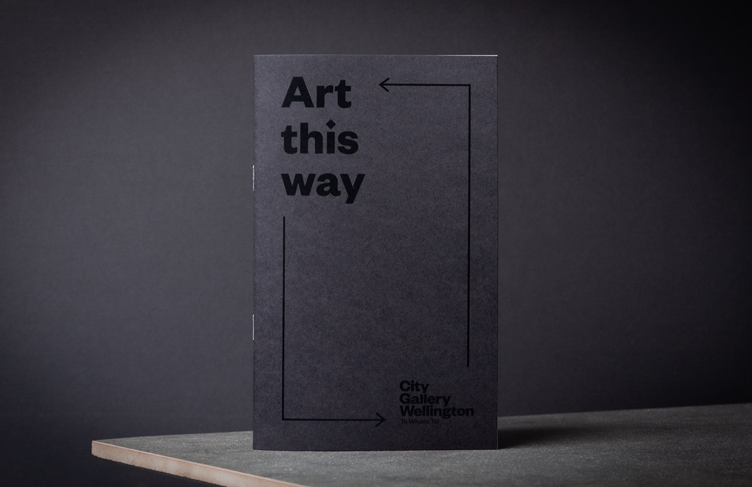
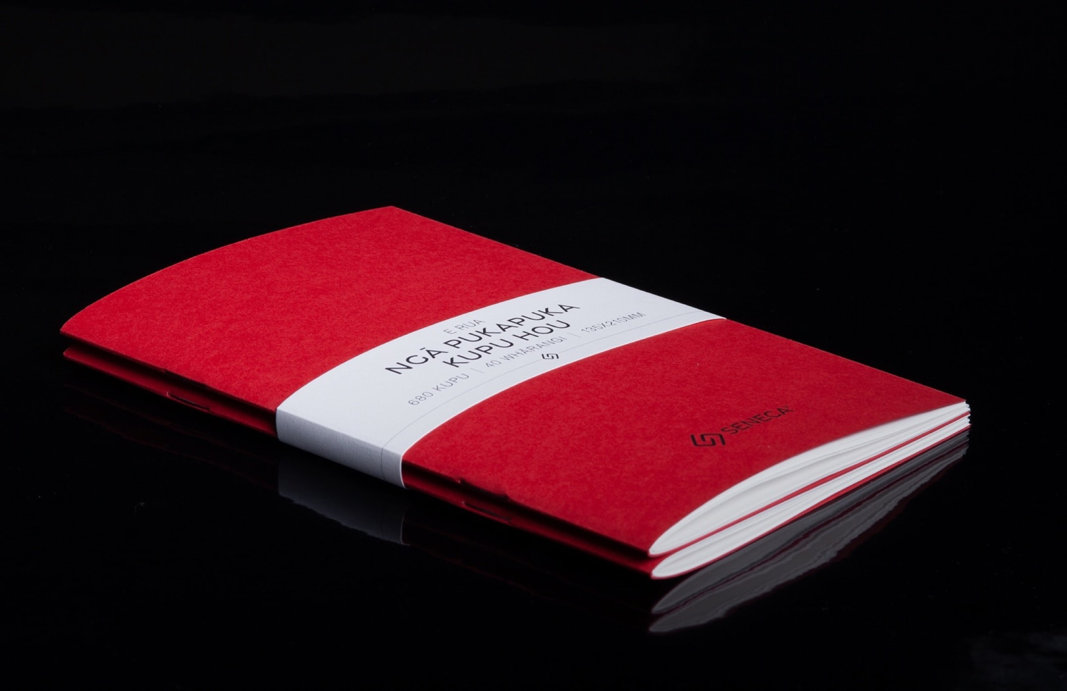
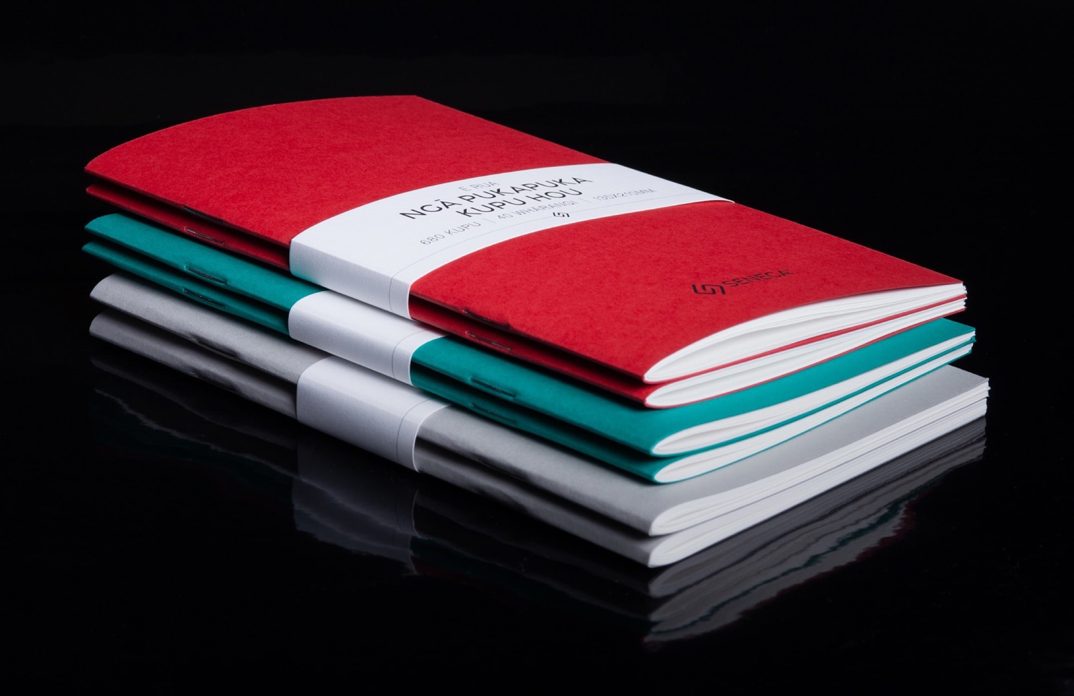
At Colourcraft, we have been producing quality work for clients since 1985. But now, it's time to make something for ourselves... Seneca. We are excited to introduce our premium range of notebooks, crafted with care and attention to detail and designed and printed by us.
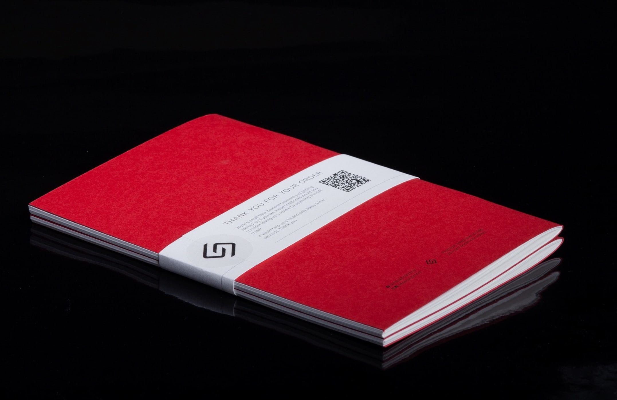
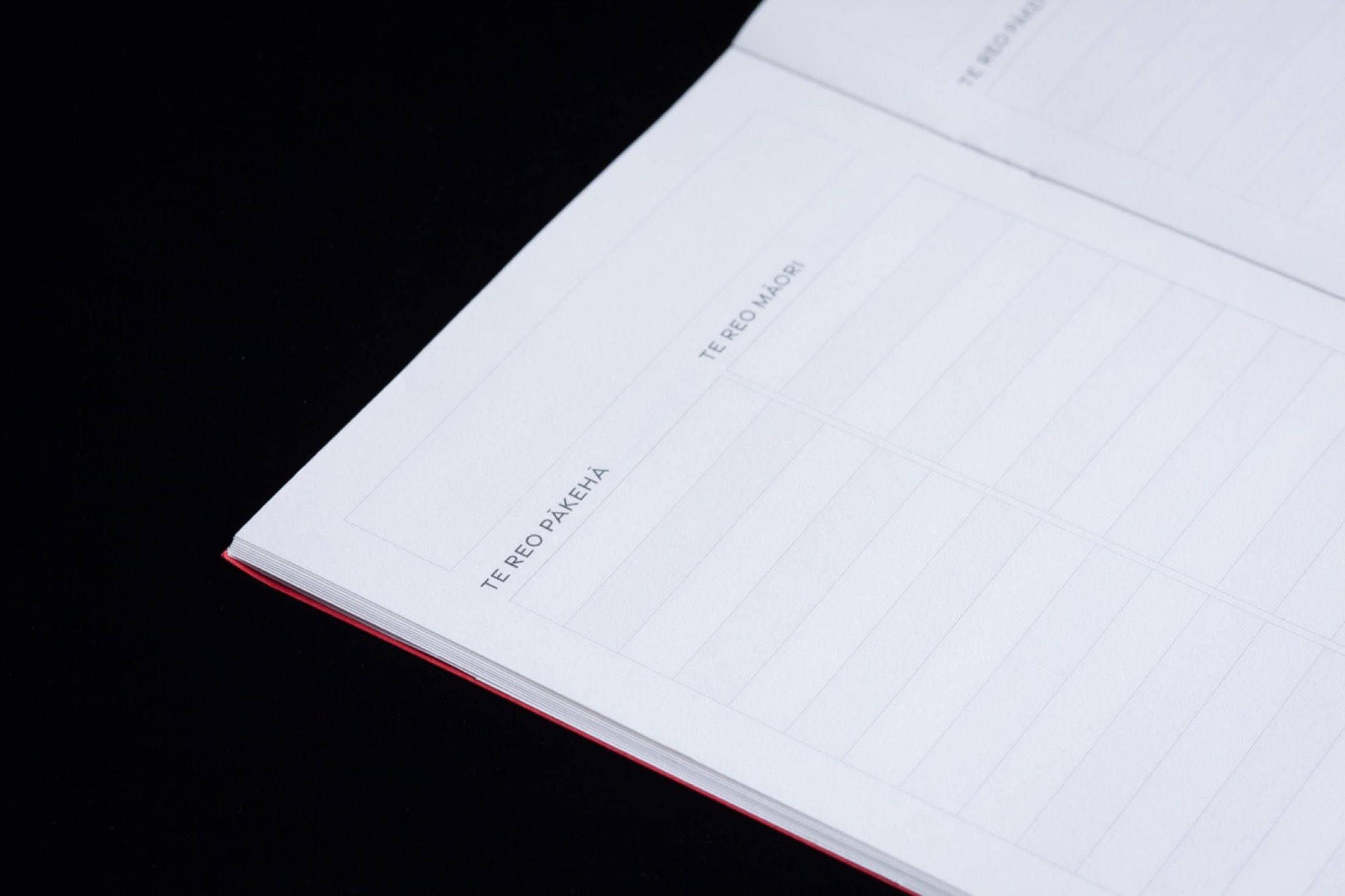
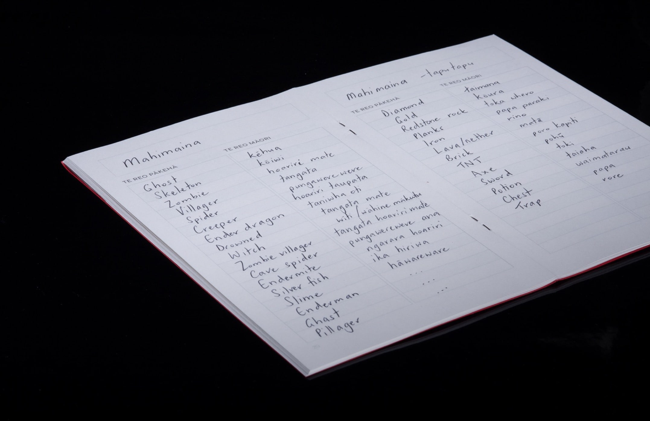
Each 2-pack of our notebooks contains two books, with pages printed with a table designed specifically for Te Reo Māori vocabulary learning or revision. We understand the importance of quality and sustainability, which is why we use only the highest quality paper for our notebooks. The 118gsm superfine, ultra-white paper has a subtle eggshell texture and is pH neutral, ensuring the best writing experience with any pen or pencil.
We believe that the things you carry and interact with daily should be of quality and sustainably produced, while remaining reasonably priced. With our Seneca Te Reo Māori notebooks, we have made sure to incorporate these values into every aspect of our product, from the materials to the final price.
As a business that has been producing quality work for clients for over three decades, we know what it takes to create exceptional products. With our Seneca Te Reo Māori notebooks, we have applied the same level of care and attention to detail that we put into every project. We hope that our notebooks will be a helpful tool for many New Zealanders on their language-learning journey while providing an enjoyable and tactile experience every time you use them.
Like what you see? Get a fast, tailored quote, with no pressure.
Specifications
Finished size:
Mid Sized: 135mm(W) x 210mm(H)
Pocket Sized: 90mm(W) x 140mm(H)
Stock:
Covers: Kraftpak Kraft 225gsm or Colourplan 270gsm.
Pages: Mohawk Superfine Eggshell Ultra White 118gsm or 104gsm
Colours:
Printed in black throughout.
Finishing:
Saddle stitched and trimmed to size.
Premium Impressions: Custom Key Cartons for Faisandier Group
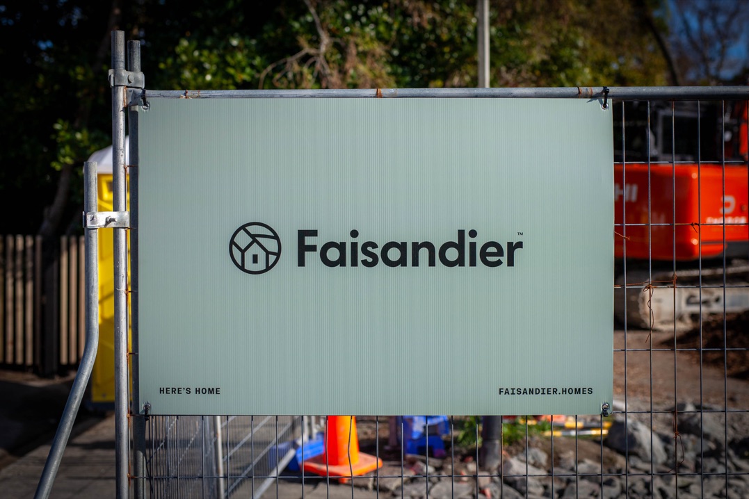
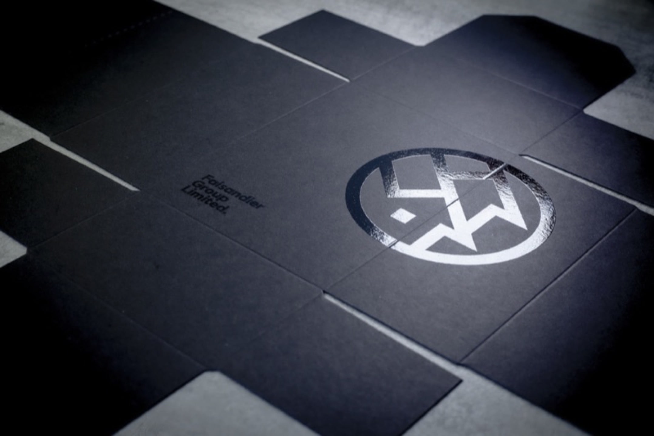
Faisandier Group is a Lower Hutt-based property developer known for building high-quality townhouses across the Hutt Valley. They've been with us since day one—literally. When the company launched in 2016, they knew who to call for print. So when the team came to us with a packaging problem, we listened. They were handing over keys to new homeowners (often first-time buyers) in cheap, generic plastic boxes. It didn’t reflect the care and quality they put into their homes. They needed something better. Something worthy of the moment.
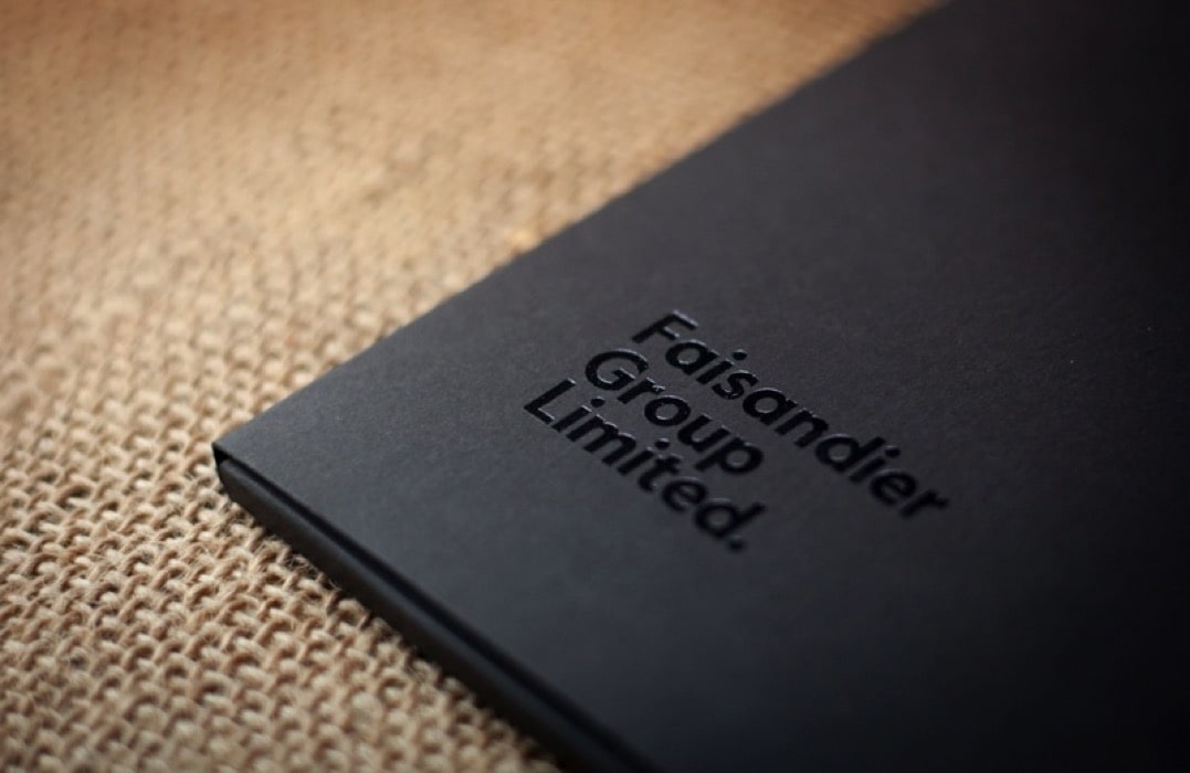
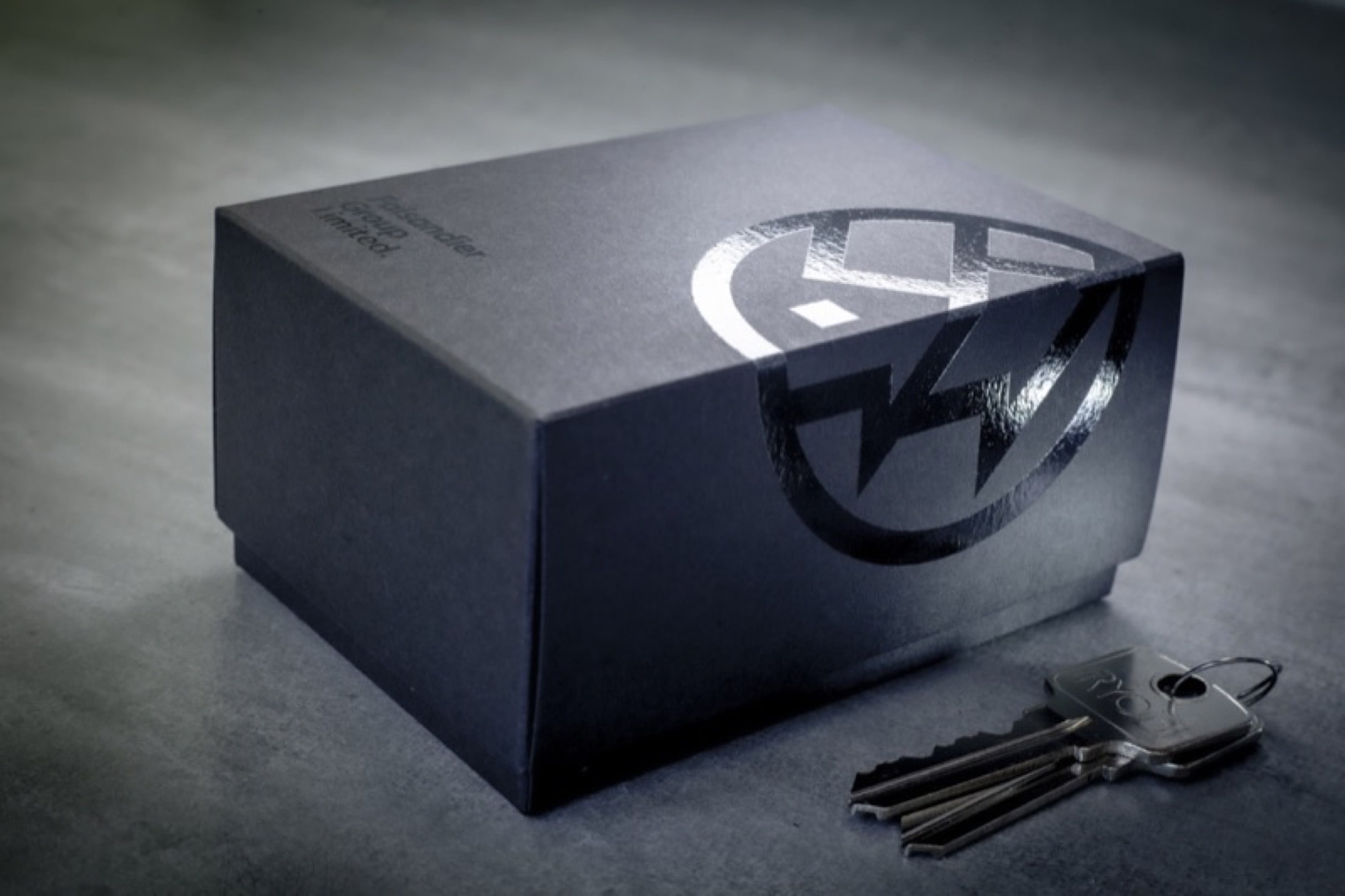
We designed and produced a bespoke two-piece key carton crafted specifically for Faisandier’s handover experience. Each box is built from thick, 320gsm Popset Black card, screenprinted with a subtle spot UV varnish that delivers a black-on-black branding effect, understated but premium. The cartons are diecut to final shape, supplied flat and unassembled, giving Faisandier flexibility for storage and use. It's a small format (85 x 65 x 30mm), but it hits hard on presentation.
Once we delivered, Simon left us a google review that says it better than we ever could:
“The finest printer in all the land! I've been working with Colourcraft for years and they've never let me down. Conversely, I have let them down many times with ridiculous requests due to my lack of planning and preparation and they have never complained or cut me loose, amazing really.
When all those other printers get wobbly legs and start dropping out of the race, crying out for water and complaining that their legs are sore... Colourcraft are gliding majestically out in front, effortlessly, unmercifully crushing their competition with the greatest service a customer could ever hope for.
Their expert advice and guidance has steered me in the right direction when my hair-brained ideas could have ended in absolute disaster. They know their stuff. I'm stirred to write a poem about how much I appreciate Colourcraft but I think this review will lose all credibility if I do, so I shall refrain. I'd give them 6 stars if Google would let me. Colourcraft is Wellington’s printer of choice.”
– Simon Faisandier, Director
That kind of feedback’s exactly why we do what we do. If you’re after something special for your next project, or just want to avoid wobbly-legged printers get a fast, tailored quote with no pressure.
Specifications
Finished size:
85(W) x 65(D) x 30mm(T)
Stock:
320gsm Popset Black.
Colours:
U.V. gloss varnish on outside.
Finishing:
Diecut and supplied flat.
Custom Hospitality Menus That Make an Impact: Durable, Stylish and Wellington Made
Bring Your Menus to Life
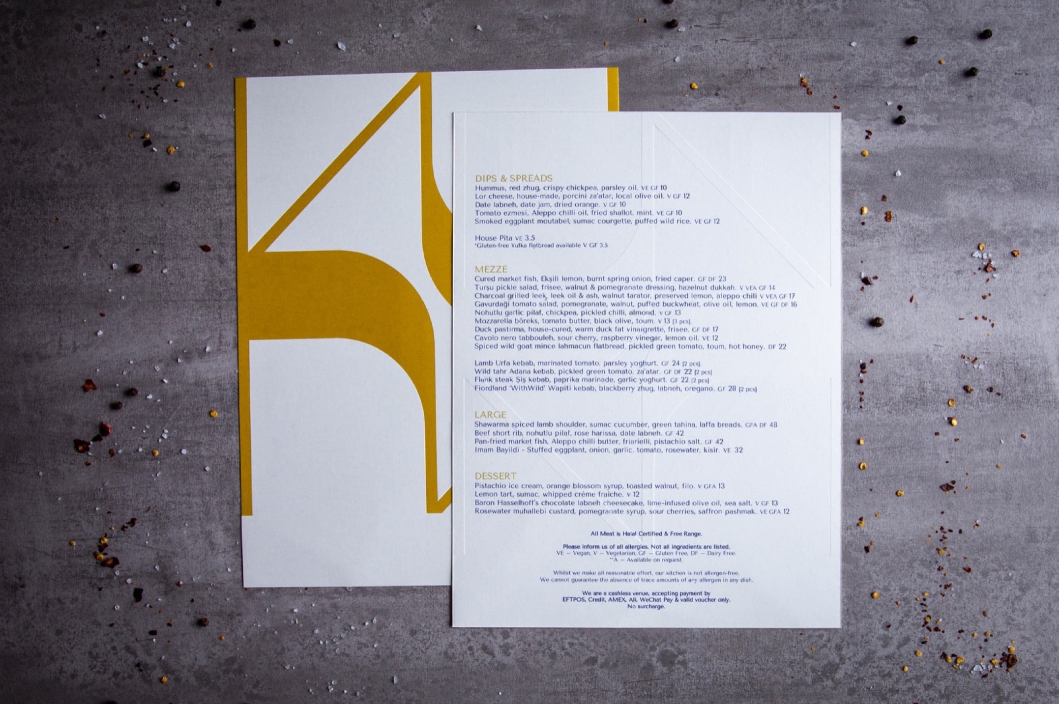
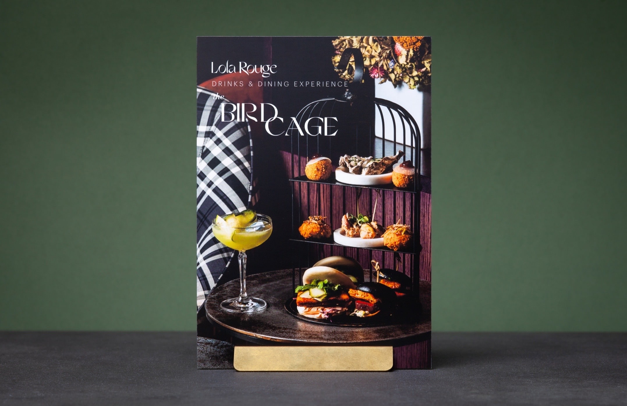
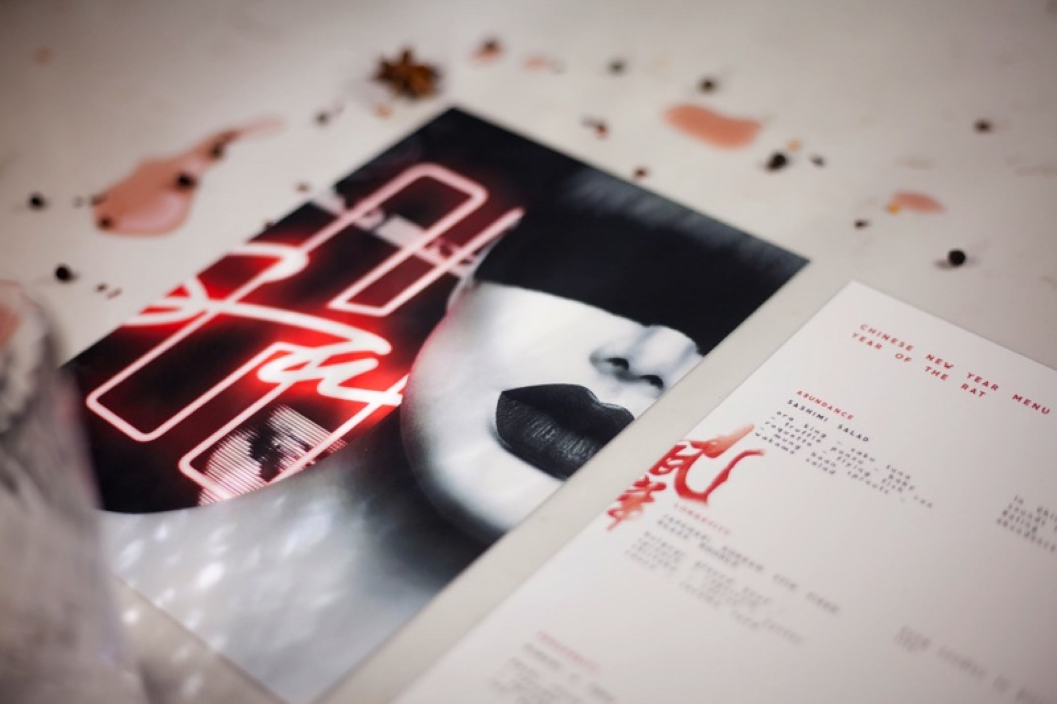
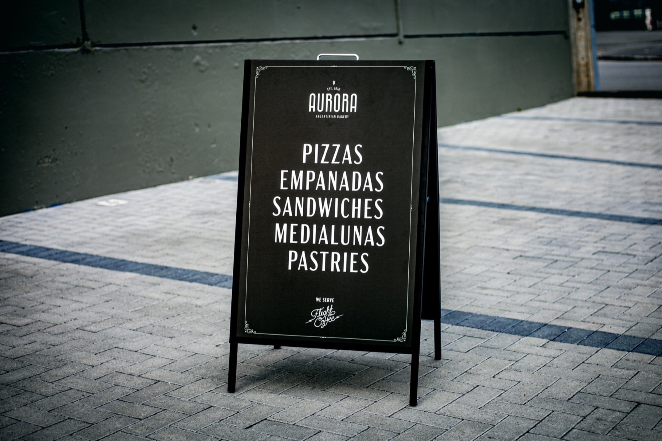
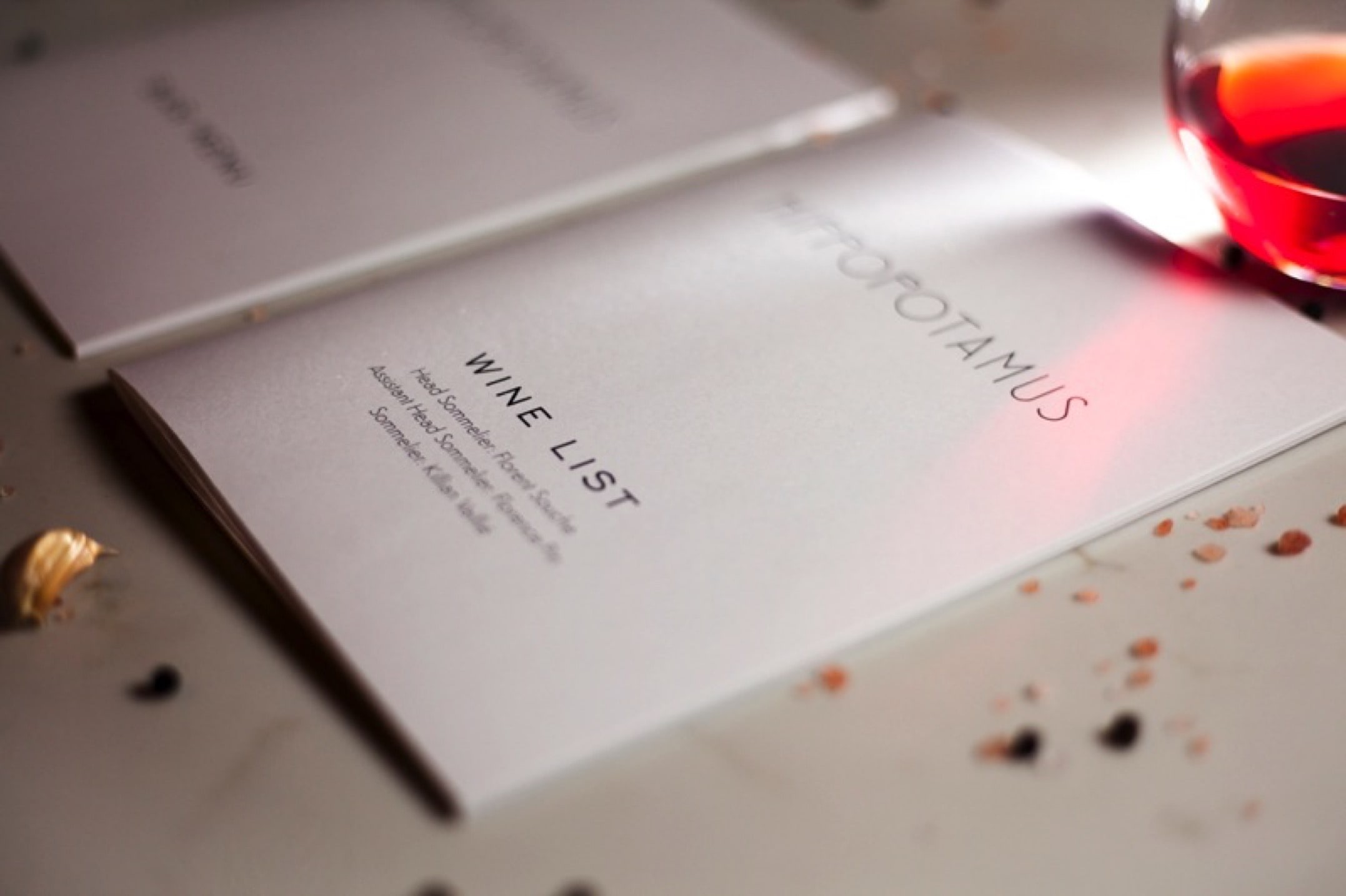
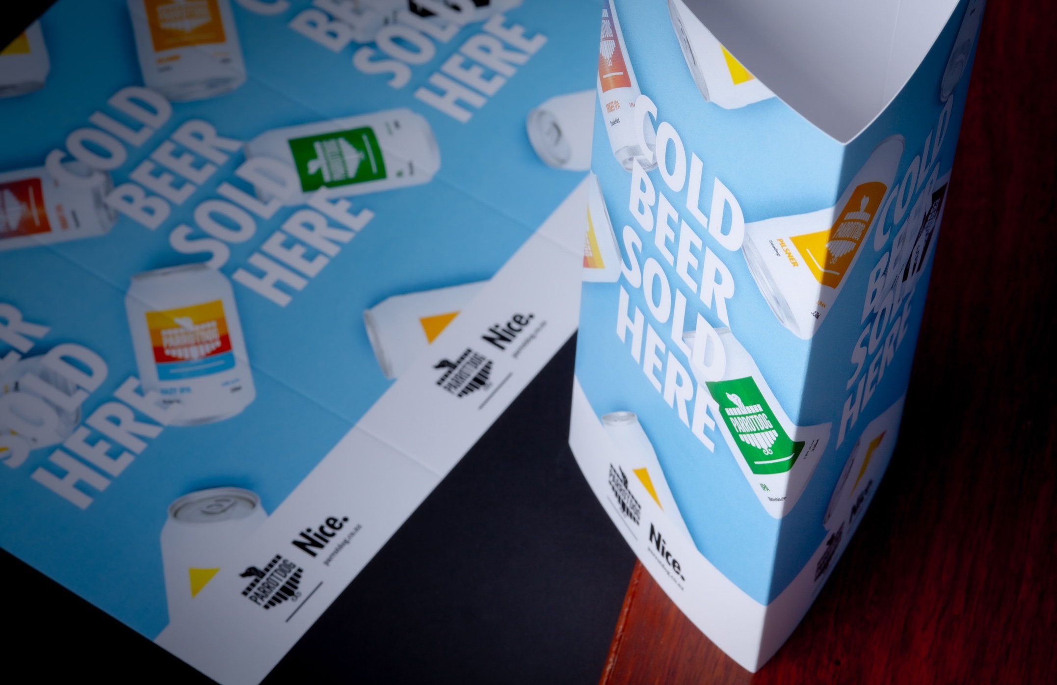
Printed menus are a vital part of your hospitality brand — whether you run a café, restaurant, bar, winery, or hotel. The look and feel of your menus communicates quality and attention to detail, enhancing the dining experience and leaving a lasting impression on guests. Based in Wellington and delivering NZ-wide, Colourcraft specialises in high-quality printed menus that combine durability, style and flexibility, no matter the size or type of your venue. From folded menus and laminated sheets to wine lists, table talkers, menu boards, and displays, we can produce the format you need.
Features & Value
Our printed menus are designed to perform under the demands of daily service while highlighting your brand. We use sturdy stocks, from eco-friendly 100% recycled papers to premium 350gsm boards, finished with scuff-resistant matt or gloss lamination for wipeable, long-lasting menus. For venues seeking a premium touch, we offer creative finishes like debossing, embossing, spot UV and custom die-cut shapes. Short runs, multi-site rollouts and seasonal updates are easy, we keep your specs on file for seamless reordering. Our production includes digital die cutting and precise colour management to ensure your menus look as intended.
Check out some of our recent projects:
Debossed Menus for Kisa Restaurant, Menus for QT Wellington, Premium Menus at Naumi Hotel
Another 5-star review we’re proud to share:
“Colourcraft has been nothing short of incredible! Thier patience, guidance and quick turnaround times have been a saving grace! I would highly recommend Colourcraft for all your printing needs.” – Karen Welgemoed (Rydges Wellington)
Next Steps Made Simple
Whether you’re refreshing your seasonal menu or rolling out multi-site updates, we make the process simple and stress-free. Request a free quote and see how easy it can be.
Built for Hospitality
- Materials: 80–350gsm stocks, eco-100% recycled, synthetic options available
- Finishes: Scuff-resistant matt lamination (most popular), gloss lamination optional
- Formats: Booklets, laminated sheets, wine lists, table talkers, menu boards, displays, folded flyers
- Custom finishing: Debossing, embossing, spot UV, die-cut shapes
- Sizes: Fully customisable; any size, any shape or rounded corners
- Turnaround: Most orders printed and dispatched within a couple of days; Once complete, Wellington CBD delivery possible in as little as 1 hour
- Order flexibility: Single prints to multi-site rollouts; artwork and specs held on file for seamless reprints
- Delivery: NZ-wide courier service, reliable and fast
- Support: Expert print guidance, file checks, and artwork prepress included
Premium First Impressions: Business Cards for FlexiTime & Invoxy
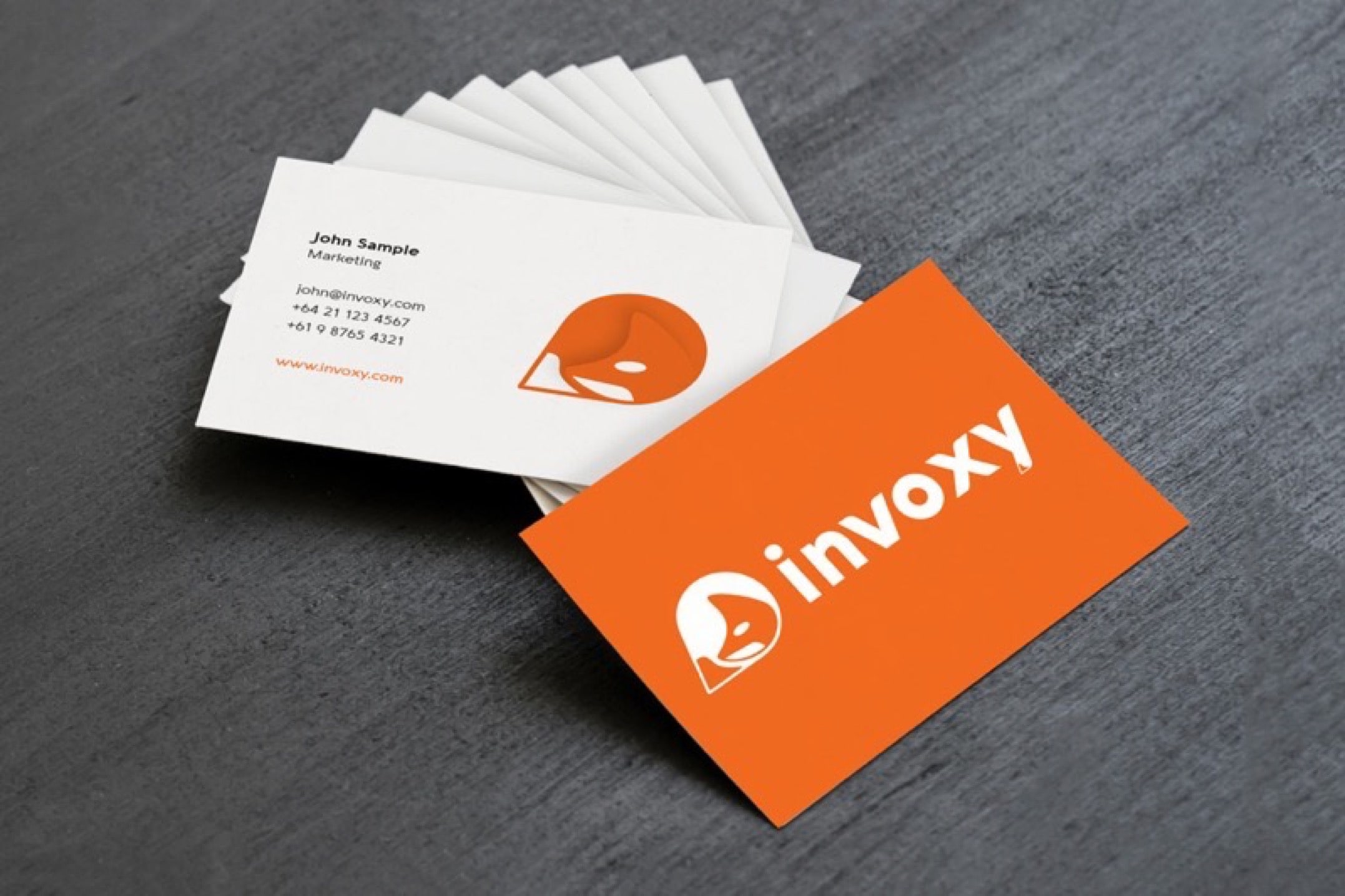
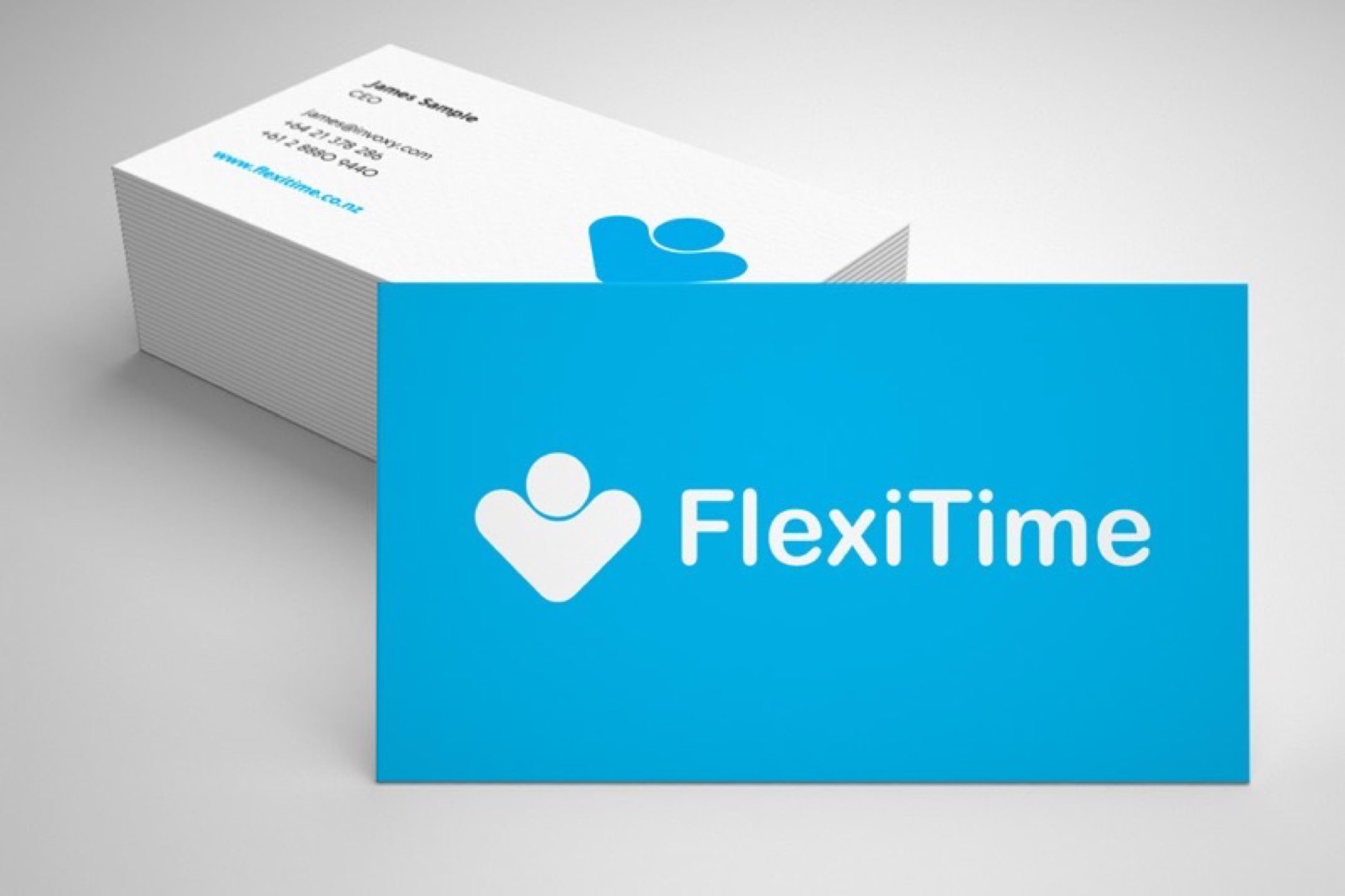
When the Wellington-based team behind FlexiTime and Invoxy needed updated business cards, they came straight to us—again. We’ve worked with them since 2016, and nearly a decade later, they’re still part of the Colourcraft family. As a leading SaaS company helping recruitment agencies and businesses manage flexible workforces, FlexiTime needed their brand to feel sharp, modern, and polished—right down to the card in your hand.
We printed their business cards on 350gsm Silk Matt stock, with full-colour CMYK on both sides. The soft-touch matt laminate not only gives a smooth, professional feel—it also improves durability, so cards stay clean and crisp even after weeks in a wallet or bag. Trimmed to a clean 90x55mm, the cards strike the right balance between presence and practicality.
"After trying multiple printing companies with mixed results we came across Colourcraft and have never looked back. The quality of the product and service are of the highest standard and we recommend them to anyone looking for a printing solution." – James Barber, Lead Designer at FlexiTime & Invoxy
Another 5-star review we’re proud to share: “We keep coming back to Colourcraft again and again! The service is incredible and the product is always top quality.” – Emily Daly, FlexiTime
That kind of feedback’s exactly why we do what we do.
Like what you see? Get a fast, tailored quote, with no pressure.
Specifications
Finished size:
90mm (W) x 55mm (H)
Stock:
350gsm Silk Matt.
Colours:
Printed in CMYK on both sides.
Finishing:
Matt laminate and trimmed to size.
Built tough: heavy-duty decals for Dynaflow and Enzed
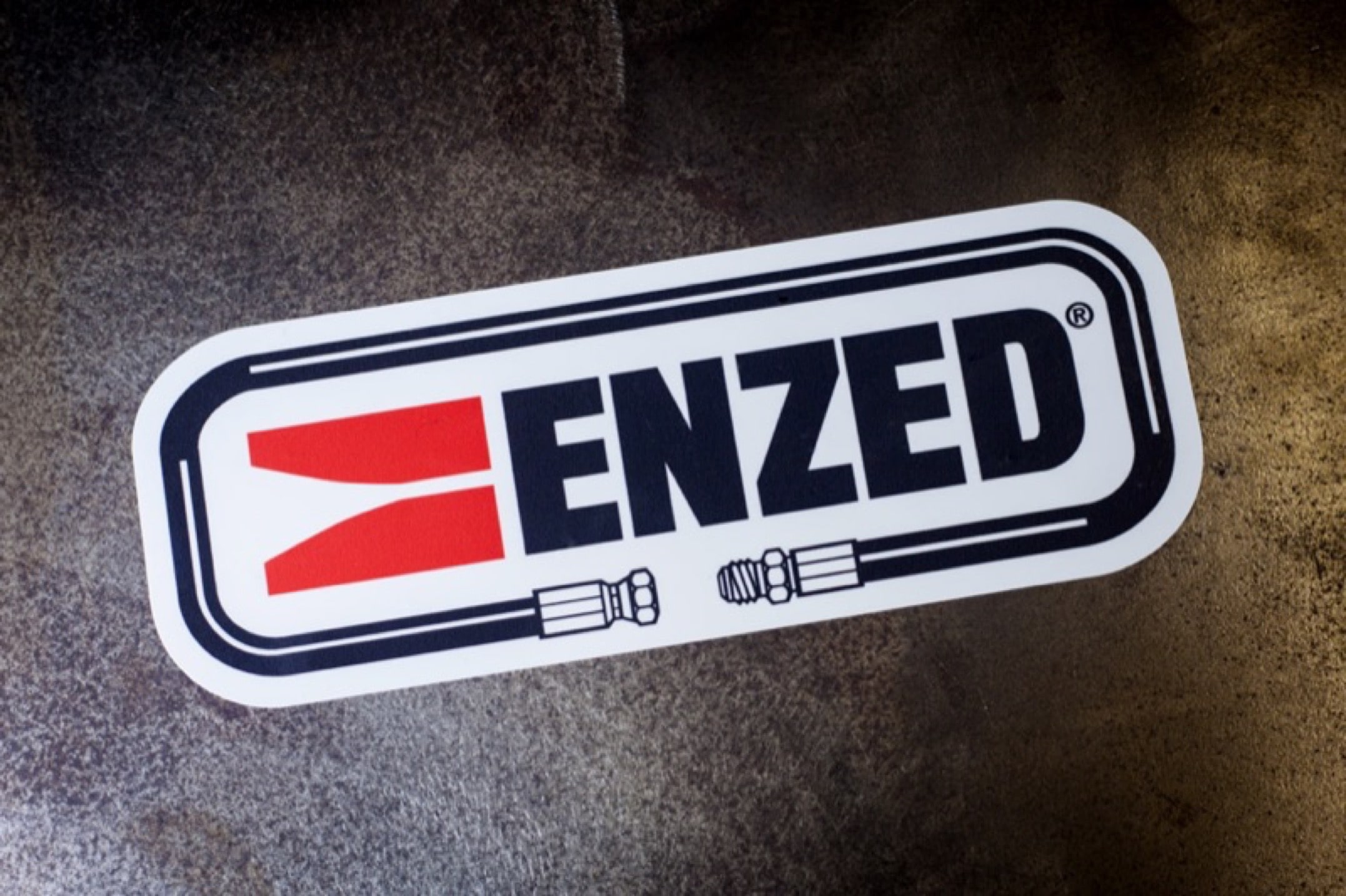
At Colourcraft, we specialise in producing high-performance print work that goes the distance. Dynaflow, a trusted name in hydraulic engineering and an authorised distributor for ENZED, approached us to create a set of durable decals suitable for use in some of New Zealand’s toughest workshop environments.
Designed for long-lasting performance in rugged conditions, we printed these decals using our Roland XR-640 wide format printer, renowned for its crisp detail, bold colours, and exceptional durability. Each decal was printed onto Avery Dennison MPI 2904 self-adhesive vinyl, then laminated with a gloss Avery Dennison DOL 2000 film to protect against UV, moisture, and abrasion. The decals were kiss cut to shape for easy application in the field.
Used across machinery and workspaces serviced by ENZED Hose Doctors, these decals combine practical durability with a professional finish—helping Dynaflow present a polished brand in even the harshest conditions.
We’re proud to support New Zealand businesses like Dynaflow with print solutions that are as tough and reliable as they are. Quality and attention to detail—every time.
Trusted by over 400 businesses in the past year alone. Learn why? Get a fast, accurate quote thats hassle-free.
Specifications
Finished size:
183 (W) x 65mm (H) with rounded corners.
Stock:
Avery Dennison MPI 2904 Vinyl.
Avery Dennison DOL 2000 Gloss Laminate.
Colours:
Colour on one side only.
Finishing:
Over-laminated, kiss-cut to shape and supplied on sheets.
